What did you find when you ran the WAVE accessibility report on your blog post(s)? What did you expect and what was surprising? Is there anything you will do differently going forward?
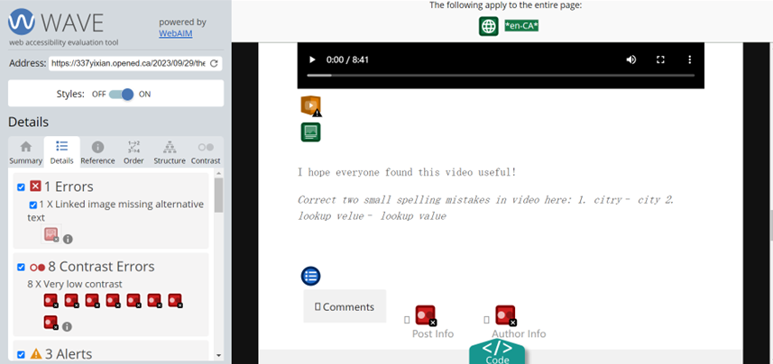
When I read this report, I was surprised by the amount of contrast errors, which reveals that my text does not have enough contrast with the background. However, when I reviewed details about the contrast errors, I found that there errors were caused by small elements in the blog such as the date, post info and author info. The reason for these errors is that the colour of these elements was grey, which made them hard to distinguish from the white background. There were no contrast errors in the main part of my blog. I might try to fix these errors by changing a theme to make a high contrast. On the contrary, I expected that there were many structural elements in my blog post. This feature was what I considered a lot when I created my blog because I knew how important it was to use structural elements like headings and headers to make my blog easy to follow and read. I also preview my blog post before posting it publicly.
Have you used Text to Speech tools before? Did you find it useful? Did you try out some of the different voices? What impact did the different voices have on your ability to absorb information?
I rarely used text-to-speech tools before, and I only tried this function in Microsoft Word. I usually use this software to take notes, and I use text to speech function when I am doing two things at the same time but I want to generally review my notes. I did not find it really useful because the voice of this function lacks emotions and intonations, which makes it sound unnatural. This reminds me of the voice principle that I learned in Module 1. Compared to a machine voice, a human voice that is able to convey emotions and intonations helps people to acquire information. Also, it is hard to listen to long content. I found that it is challenging for me to stay focused on processing information while listening to long content in a machine voice. For me, different voices did not make a big difference in my ability to absorb information. However, I believe that the Text-to-Speech tool is still useful for people with visual impairments or reading disabilities. I think that personal preference would be a factor contributing to the effect of different voices on the ability to absorb information. Since these people are more sensitive to voice, they might be able to detect nuances among different voices, and different voices work for different people.
Which design principles did you use to create your infographic in Canva? Which elements of a ‘good infographic’ were you able to incorporate? What other principles did you consider? What does the template make easier and what does it make harder when creating your infographic?
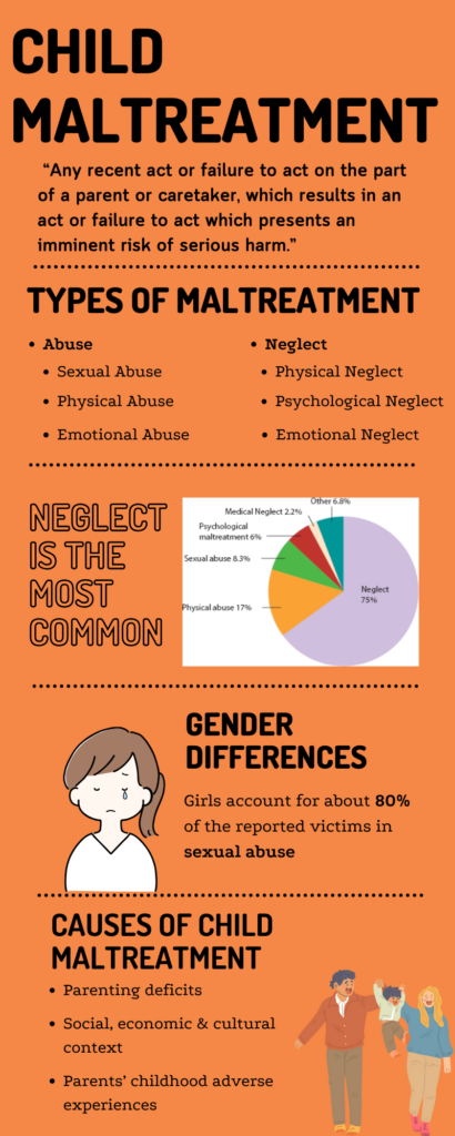
The topic of my infographic is child maltreatment, which I studied in one of my psychology classes. This was my first time using Canva, and I found that it was easy to align elements because you can use the dotted lines to help you organize. I used hierarchy to help focus on the design and the content by creating headings and adding bullet points. I also used repetition in colours and fonts to make my infographic look harmonious and help people to remember information. In terms of balance, the whole infographic consisted of 5 blocks and I tried to control the amount of information and pictures in every block to make a good balance. However, I found it hard to apply the contrast principle when I created the infographic. I used orange as my main background colour, but black as my font color. Although it creates some contrast, I’m not sure whether black is the most appropriate colour to use with an orange background. The template makes it easier for beginners to create their own work. There are specific templates for different purposes, which also enhances the accessibility of infographics for a target audience. However, the template might limit people’s ability to customize. To sum up, it was an interesting experience for me to create my own infographic by using Canva, and I grasped some of these design principles when I tried to apply them in my work. I still need to explore more tools like Canva to improve my skills in creating infographics and posters.
The link of my infographic: https://www.canva.com/design/DAFxNvUlD68/hKsHPpo6JOos2W8HRy1rpg/edit?utm_content=DAFxNvUlD68&utm_campaign=designshare&utm_medium=link2&utm_source=sharebutton